0%
BG-Color:
White (#FFF)
Order:
Random Ordered
View:
Grid List
TILDE
Type:Gender Diverse Film Festival
Category:Digital, Identity, Print, Web
Year:2019
Photography (Folio):
Printing:PressPrint
044 TILDEMore

TILDE is Melbourne’s Trans & Gender Diverse International Film Festival, established to showcase the work of trans and gender diverse filmmakers, and share stories from and about trans and gender diverse communities. Created as a space for representation, celebration and visibility, the festival provides a platform for filmmakers and audiences to connect over diverse perspectives—offering an alternative to the historically limited and distorted portrayals of gender in film.

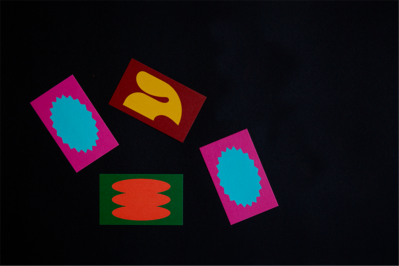
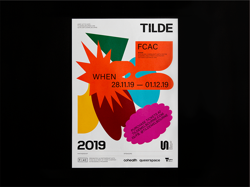
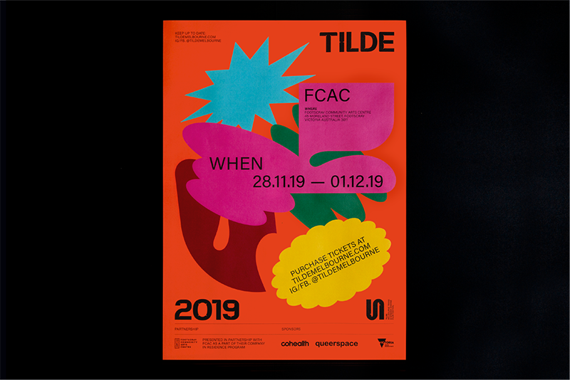
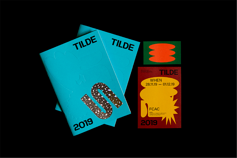
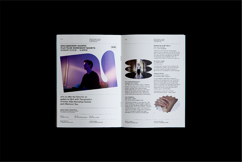
The primary marque is drawn from the (tilde) ‘~’ symbol representing an approximation and an in-between-ness; highlighting the non-rigid boundaries of gender. The marque’s fluid form also depicts ideas of unique journeys and experiences. The ‘small nooks’ seen throughout, carry the narrative of ‘safe spaces’ whilst dually representing the idea of ‘non-conforming’. Supporting abstract shapes convey key values: energy and dialogue through angular forms, transformation through soft curves, and community through dynamic, evolving compositions. The use of vibrant colours enhances the celebratory and inclusive atmosphere, creating a flexible identity that adapts as TILDE continues to evolve.

TILDE
Type:Gender Diverse Film Festival
Category:Digital, Identity, Print, Web
Year:2019
Photography (Folio):
Printing:PressPrint

TILDE is Melbourne’s Trans & Gender Diverse International Film Festival, established to showcase the work of trans and gender diverse filmmakers, and share stories from and about trans and gender diverse communities. Created as a space for representation, celebration and visibility, the festival provides a platform for filmmakers and audiences to connect over diverse perspectives—offering an alternative to the historically limited and distorted portrayals of gender in film.

The primary marque is drawn from the (tilde) ‘~’ symbol representing an approximation and an in-between-ness; highlighting the non-rigid boundaries of gender. The marque’s fluid form also depicts ideas of unique journeys and experiences. The ‘small nooks’ seen throughout, carry the narrative of ‘safe spaces’ whilst dually representing the idea of ‘non-conforming’. Supporting abstract shapes convey key values: energy and dialogue through angular forms, transformation through soft curves, and community through dynamic, evolving compositions. The use of vibrant colours enhances the celebratory and inclusive atmosphere, creating a flexible identity that adapts as TILDE continues to evolve.

001
002
003
004
005
006
007